To stay ahead of the pack, you’ve got to keep moving. Taste doesn’t matter to you, because taste is what people who watch care about. All you can say with certainty about Robert Rauschenberg is that he was avant-garde – he has had too many different ideas to be able to skewer him – and the first retrospective since his death in 2008, at the Tate Modern (on until April 2), compresses these with ability and care.
We see the White Paintings, the Black Paintings, remnants of the first-ever art “happening” (which Rauschenberg organised with John Cage), his exuberant postmodern silkscreens, his sculpture-painting combines, and a large mud bath, which reacts to noise by bubbling. This, again, was part of one of his ground-breaking, hi-tech happenings, when full-sized tennis games would be synced to sensors and infra-red, in front of 2,500 people in autumnal New York in 1966.
So far, so far out. But what can we take from this very 20th-century figure, in the face of the White Cubes, the Hirsts and the Quinns, with their fiscal and cultural jackboot so firmly held down on the face of art lovers?
Take Rauschenberg’s White Paintings. As his colleague Cage said of them: “No subject/No image/No taste/No object/No beauty/No message/No talent/No technique (no why)/No idea/No intention/No art/No feelings/No black/No white (no and).” All that came before Hirst.
At Black Mountain College in the 1950s, Josef Albers taught Rauschenberg about colour. He demonstrated that each colour does not have inherent impact – that all that matters is what colour it is placed next to. Thus, if I am following this correctly, Albers eliminated notions of “taste” in Rauschenberg. One colour does not have preconceived notions of taste. Pink is not kitsch, etc.
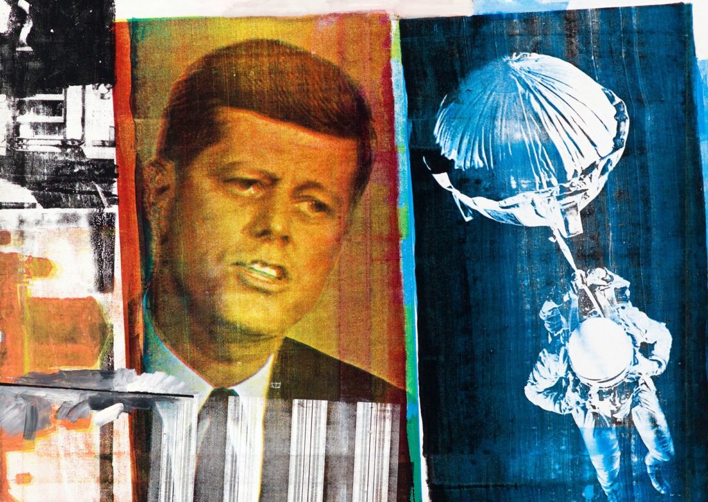
The exhibition covers the gamut of Rauschenberg’s work, from his illustrations from Dante to his poetic silkscreens, containing references to Rubens’s Venus in Front of the Mirror, then Senator JFK, over emphatic blue and red washes. This section is the most resurgent with classic, postmodern, Americana Rauschenberg. We almost yearn that his combines – coloured in a sepia, playroom nostalgia – wouldn’t feel so outmoded, along with some of his elemental sculptures.
Rauschenberg said he wanted his paintings to look like what was going on outside his window. His Red Paintings, which incorporate 3D sculpture, were painted in a shade that he called “pedestrian colour”. “Walking on the street … or in any group of people … the mass, no matter how colourful it was … nothing was particularly outstanding. Someone might be wearing a very bright tie, or green shoes, but somehow it was absorbed.”
Rauschenberg, to skewer him a bit, tries to absorb difference into the mass of his frenetic workshop, with its ever-changing “lust for everyday life” idea. His all-absorbency was unconquerable – his omnipresence in art showed that one colour was not more important than another – he wanted to have it all, and to sublet every colour there.
Areas of Catholic Herald business are still recovering post-pandemic.
However, we are reaching out to the Catholic community and readership, that has been so loyal to the Catholic Herald. Please join us on our 135 year mission by supporting us.
We are raising £250,000 to safeguard the Herald as a world-leading voice in Catholic journalism and teaching.
We have been a bold and influential voice in the church since 1888, standing up for traditional Catholic culture and values. Please consider donating.