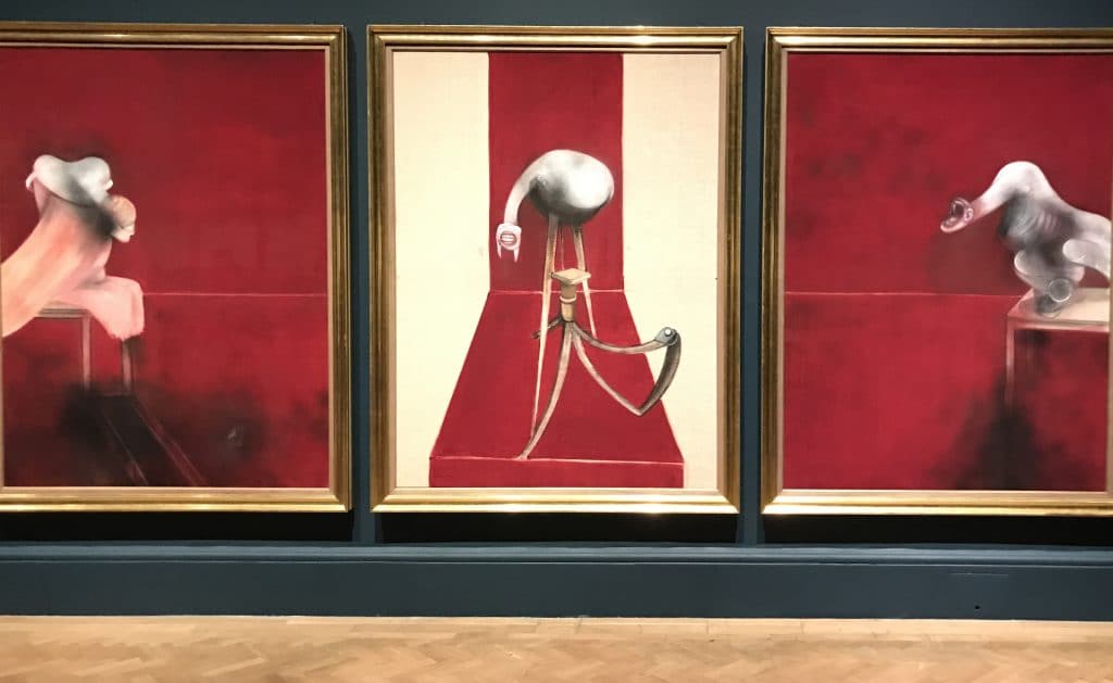
Less than a year after a major refurbishment, the Courtauld Gallery has already had exhibitions of two of the biggest names in early modern art. There’s not much to rival Vincent van Gogh or Edvard Munch for raw power. Pieter Bruegel the Elder might have the same name recognition, but the nature of his work couldn’t be more different. Instead of flurries of colour and indications of imminent mental collapse, the Courtauld presents Traces: Renaissance Drawings for Flemish Prints.
These are very small works in a very small room. To drive home the intimacy, a box of magnifying glasses greets visitors at the gallery entrance. This is the world of the antiquarian study rather than the plutocrat’s yacht. It’s a retreat into a realm of reflection. So much so, it feels like an intrusion when one of the few other visitors gets too close to one’s magnification zone.
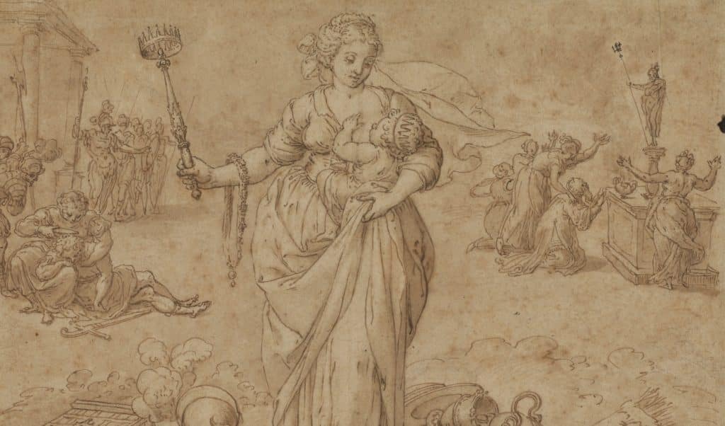
Once up close to the admirably non-reflective glass, it is a highly personal world. We are more familiar with the work of Bruegel, Martin de Vos and Jan van der Straet on large, colourful canvases – or perhaps festive greeting cards. None of the prints or drawings here would work for Christmas. There are plenty of other religious themes, although not everyone may remember the Bad Shepherd. Here, he and his accomplices provide a dramatic subject. Their hovel has a collapsed roof and a sheep lying on the ground doesn’t look like it’s having a nap. There is no sign of a Good Shepherd.
The beauty of the Bad Shepherd is that it gives the curators a chance to show the incised back of a drawing that was later turned into a print. It’s rare to find the evidence of the process intact. It’s complicated, which might be one of the factors that have put off collectors. The essence is simple: transfer a drawing with ink, chalk and wash to a metal plate and then press out a print. Somehow, the technicalities seem less straightforward although there is a useful video to help visitors.
One of the psychological barriers, for this viewer at least, is the way that images are reversed. Artists had a lot to think about when their drawings were not just idle sketchings but preparatory works for a print. The magic of the exhibition is in showing the two, side by side. Almost always the printed version will stand out for its clarity. Those who like some hazy mystery will prefer the softness of the drawings.
The prints have a more sharply defined look that is relevant to the 16th century. Printing was the foundation on which the Protestant Reformation could build its empire of tracts, polemical pamphlets and, above all, the vernacular Bible. The word was everything. Visual accompaniments were a frivolity, always accompanied by subliminal worries about graven images, although Foxe’s Book of Martyrs wouldn’t be much without them. The engraver could have been viewed as the agent of Satan but wasn’t.
Keeping up with the times, the Courtauld curators are promoting a female publisher of the 16th century whose products are on display. Volcxken Diericx was a press baroness of her day. There were perhaps more powerful women in that business 450 years ago than there are now.
Diericx was known to be a Catholic, while much of her business was with Protestants. The exhibition doesn’t dwell on what might for Herald readers be fascinating and often unknown territory. It was certainly bloody. The 16th-century Netherlands saw the execution of many Protestant heretics; or would have done if most of those with a death sentence placed on them hadn’t run away. The Reformers’ revenge on their Catholic oppressors was smaller in terms of martyrs, but the Beeldenstorm brought shocking material destruction.
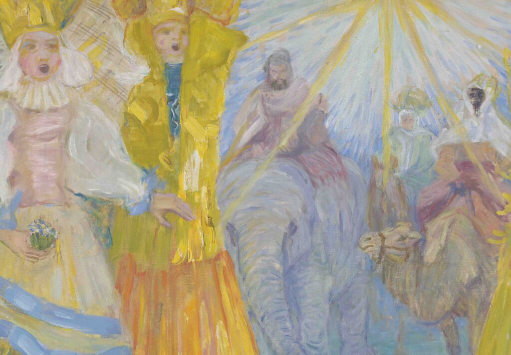
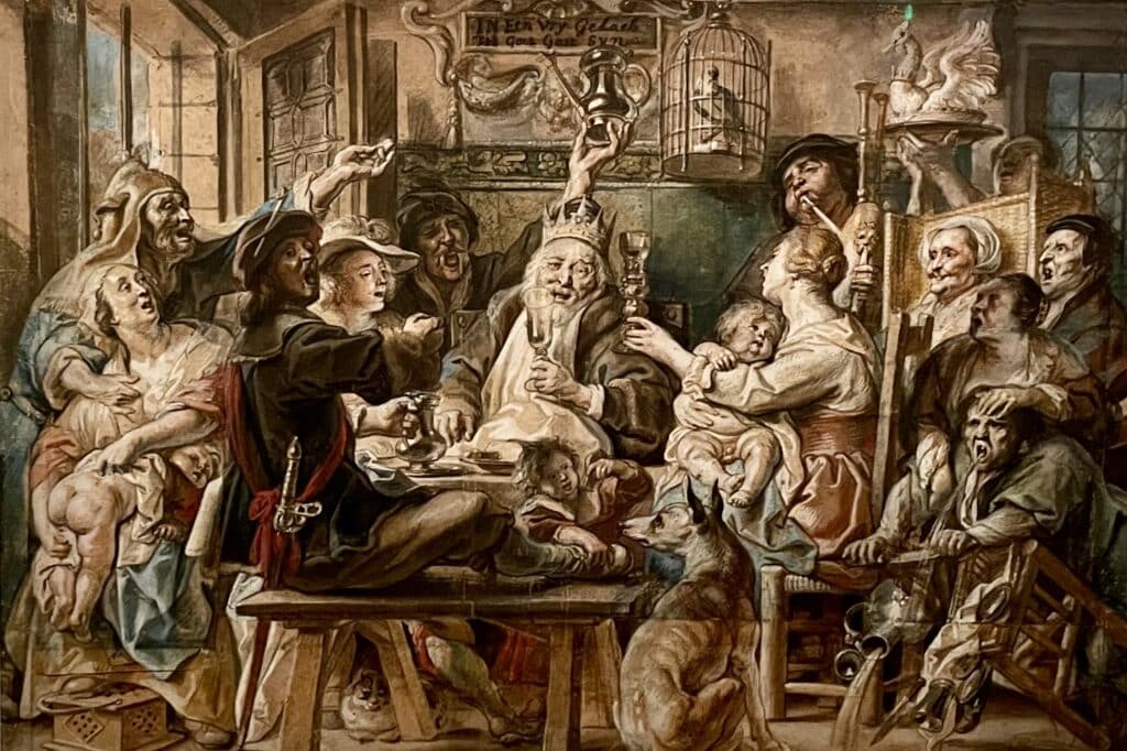
The exhibition includes numerous religious engravings, without the presence of a classic such as Defenders of the Catholic Faith in the Netherlands Adoring the Virgin by de Vos. Most of the great Dutch artists of the 16th and early 17th centuries were Catholic, including Bruegel. The politics of the time meant delicate manoeuvring if they were to keep their lives and livelihoods. Playing it safe meant plenty of non-sectarian imagery. There’s The Prophet Malachi and The New Jerusalem, plus Classical imagery such as The Colossus of Rhodes and The Race of Atalanta and Hippomenes.
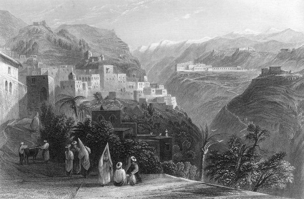
Least controversial of all would have been landscapes. Bruegel inevitably depicts some boisterous peasant revelling in his Fair at Hoboken. If one gets out the magnifier it’s possible to see that he has squeezed in a distinctly non-Calvinist religious procession bearing a saint aloft. It’s the sort of detail that makes these prints so rewarding for viewers with patience.
Visitors only become aware of how different from the current mainstream this realm of art appreciation is when they exit the exhibition space and re-enter the Courtauld of 2022. Colour and bigness are everywhere. For the first time, I noticed that even the famous circular staircase has handrails painted a lively shade of Yves Klein blue. The field of Flemish prints and drawings might sound foxed and fusty, but it is a refreshing look at cutting-edge technology five centuries ago.
Areas of Catholic Herald business are still recovering post-pandemic.
However, we are reaching out to the Catholic community and readership, that has been so loyal to the Catholic Herald. Please join us on our 135 year mission by supporting us.
We are raising £250,000 to safeguard the Herald as a world-leading voice in Catholic journalism and teaching.
We have been a bold and influential voice in the church since 1888, standing up for traditional Catholic culture and values. Please consider donating.